Pareto Chart
Alan P. Picarillo, MD
Maine Neonatology Associates & the Maine Medical Center Department of Pediatrics.
Objectives:
1. Describe the Pareto principle
2. State the graphical representation of the Pareto chart
As physicians continue to look for ways to deliver high quality care to their patients and families, newer tools and methods are being developed. Initially developed by manufacturing, quality improvement methods have been slowly adopted by healthcare and have now become standard curriculum taught in medical schools. The IHI Model for Improvement allow for teams to create a model for change, test proposed changes in clinical situations, measure the results and then accept or modify the proposed changes. Additional tools, such as process maps, Pareto charts, Ishikawa diagrams and key driver diagrams allow for further structure to the team during the creation and implementation of a quality improvement initiative. These tools are important in providing structure and visual representation for ongoing quality projects. As participation in quality improvement is becoming an expectation for health care providers, familiarity with these tools will assist teams with implementing improved processes in their local systems of care.
The Pareto principle was initially described by management consultant Joseph Juran as he described than for many events, approximately 80% of the effects come from 20% of the causes1. This principle was named for Italian economist Vilfredo Pareto, who determined that 85% of the overall wealth in Milan was concentrated in only 15% of the population. This was adopted by accident prevention practitioners as hazards could be addressed in a systematic order and then targeted interventions to eliminate the more common causes of injury will be more successful than random targeted interventions.
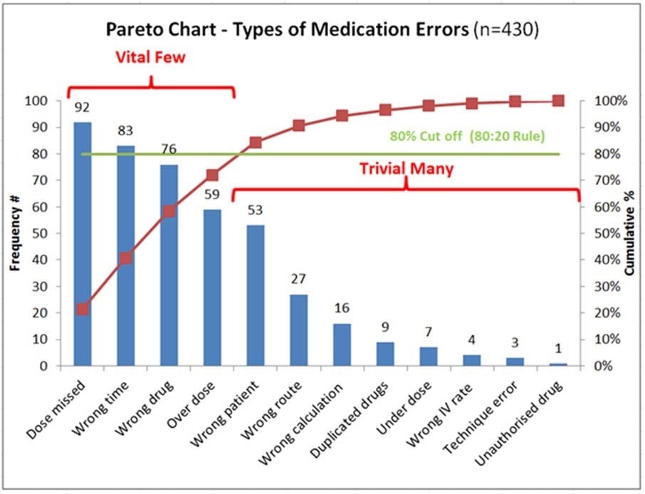
Juran adapted this principle of separating out the vital few causes of an event from the trivial many, as a majority of organizational effects resulted from just a few causes. This became the basis for the Pareto chart (Figure 1), a bar graph in which causative factors for defects in a process are ordered from more frequent to less frequent, allowing for the team to concentrate their efforts on the factors that have the greatest impact2. The horizontal axis of the chart contains the categories of the problem identified and the vertical axis contains the frequency of the measurement. Simply, a large proportion of quality problems are created by a small number of causes, allowing for a more focused approach to prioritize more frequent problems in a certain process. By focusing on the largest and most frequent issues, which can be graphically represented, the team can focus their efforts to achieve the greatest improvement3.
The Pareto Chart shows the relative frequency of defects in rank-order, and thus provides a prioritization tool so that process improvement activities can be organized to “get the most bang for the buck”, or “pick the low-hanging fruit”. There are many computerized programs that can construct Pareto charts, from statistical programs or even Microsoft Excel©, although basic charts can even be constructed by hand. The Pareto chart is a valuable quality improvement tool that allows team members to separate out the “vital few” from the “trivial many” when assessing potential defects in a given process.
Figure 1 Pareto chart: Example of Pareto chart of type of medication errors, with the high frequency errors to the right, representing the “80%” and the lower frequency errors to the left, representing the remaining “20%”4.
References
- Juran JM, Godfrey AB. Juran’s Quality Handbook (5th edition). New York City: McGraw-Hill; 1998
- Wilkinson L Revising the Pareto Chart The American Statistician 60 , Iss. 4,2006
- American Society for Quality. Cause analysis tools: Pareto chart. 2009 [accessed 8/9/2017]; http://www.asq.org/learn-about-quality/cause-analysis-tools/overview/pareto.html
- http://www.cec.health.nsw.gov.au/quality-improvement/improvement-academy/quality- improvement-tools/pareto-charts