Tips for using learning theory to craft an effective PowerPoint presentation
Eric Brown MD
March 2020
We have all endured slide-based lectures that left us yawning or scratching our heads in confusion. Presentations with too many slides, too busy slides, or hard to see fonts and diagrams are common in medical education and can sabotage even the most dynamic speaker or an otherwise fascinating topic. Here are some tips for crafting slide-based visual aids that will better support your learning objectives and keep learners engaged
- Remember that slides do not have to be the default option
- For every presentation you give, ask yourself whether slide-based visuals are the ideal means to deliver your message.
- For example, a lecture that introduces and then uses a lot of new terms may be better served with a handout with definitions that learners can reference throughout the talk.
- For every presentation you give, ask yourself whether slide-based visuals are the ideal means to deliver your message.
- Use a logical, time-tested story structure
- The three-act storytelling structure has been around for thousands of years and is firmly imbedded in most learners’ long-term memory.
- By visually accessing this structure in your learners’ long-term memory, you are able to create a clear pathway for learning new information in their limited-capacity working memory.[1]
- Act 1: Introduces the setting, main character (or subject), and an unresolved state of affairs.
- Slide titles in this phase of your talk should reference emotions or situations already familiar to the learner.
- Act 2: Drives the story forward by picking up on the unresolved state of affairs.
- Use a story-board approach for organizing concepts and sub-concepts.
- Limit major concepts to 4-5.
- Use a slide hierarchy with color coding or other visual cues to anchor the learner.
- In this graphic, major concepts are all on slides with orange backgrounds while supporting concepts are yellow and sub-concepts are white. Visual adapted from Beyond Bullet Points
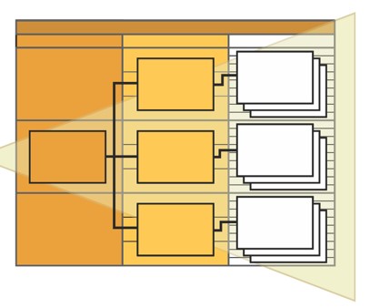
- In this graphic, major concepts are all on slides with orange backgrounds while supporting concepts are yellow and sub-concepts are white. Visual adapted from Beyond Bullet Points
- Act 3: Frames a climax and resolution around your topic
- Recycling visual cues from the first “act” can help solidify conclusions
- Act 1: Introduces the setting, main character (or subject), and an unresolved state of affairs.
- Apply Mayer’s principles for designing instructional multimedia presentations
- Four evidence-based principles for reducing learners’ extraneous processing[2]:
- Coherence: Exclude extraneous words, pictures, and sounds
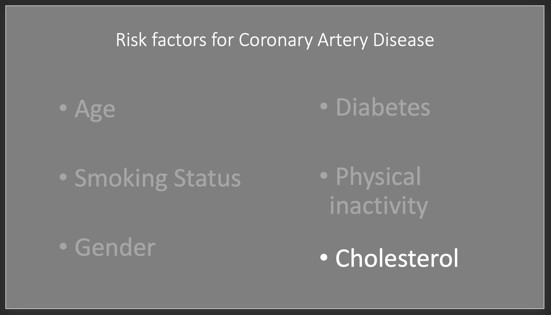
- Signaling: Highlight essential material with yellow boxes or high contrast
- Redundancy: Do not add on-screen text to narrated animations or videos
- Spatial Contiguity: Place printed words next to corresponding graphics
- Four evidence-based principles for reducing learners’ extraneous processing[2]:
- Watch David JP Phillips “How to avoid death by PowerPoint” and then apply his “6 rules”[3] https://www.youtube.com/watch?v=Iwpi1Lm6dFo
- One “message” per slide.
- No text sentences (instead use written words/phrases as talking points)
- When audience members read a sentence while you are speaking it, they hear nothing!
- Size: The most important part of your slide should be the biggest.
- For example, the title or heading on the slide should be smaller than the points you are trying to make.
- Use contrast to your advantage.
- Dark background with light text
- Use high contrast to draw attention to important areas of busy slides
- Six or less ‘objects’ per slide
Hopefully these tips help keep your audiences more engaged during you slide-based talks. When in doubt, try this mnemonic:
ONE message per slide
FEW matching colors
VERY FEW fonts
PHOTOS, not clipart
[1] Atkinson, Cliff (2011). Beyond Bullet Points: Using Microsoft PowerPoint to Create Presentations that Inform, Motivate, and Inspire. Microsoft Press, USA.
[2] Mayer, R. E. (2008). Applying the science of learning: Evidence-based principles for the design of multimedia instruction. American Psychologist, 63(8), 760–769.
[3] Phillips, David JP (2011). How to Avoid Death by PowerPoint. Presentation Skills Ltd. Ted Talk Video available on YouTube and davidjpphillips.com
Download PDF