Frequency Plots:
How to tell a quality improvement story utilizing “plots”?

Sonja C. Orff, RN, MS, CNL, CSCT
Quality and Safety Coordinator
Operative and Perioperative Services
Maine Medical Center
September 2021

Learning Objectives:
- Describe how to utilize a frequency plot/graphic to display quality improvement data
- Identify the benefits of the different types of frequency plots
The adage, “a picture is worth a thousand words” carries significant weight when embarking on a quality improvement opportunity. Graphic displays of data offer insights that lists of numbers alone cannot. Visual tools to analyze trends and patterns in quality are powerful aids to achieve continuous improvement. Frequency plots provide graphical display of data sets that reveal associations and relationships. There are at least six frequency plot methods which one can choose.
The frequency graph one chooses depends on the type of data to be analyzed. There are graphics for continuous data, which is data that can take any value (e.g. height, weight, temperature, length) and graphics for attribute data, which is data that can be counted and given a whole numerical value (e.g. surgical case volumes). The goal is to compare the differences between groups, and/or to study the relationships between variables and values. Below are examples and applications of frequency plot graphics.
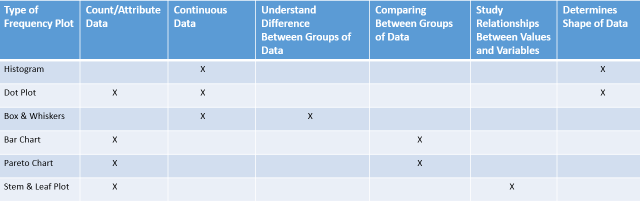
Histogram
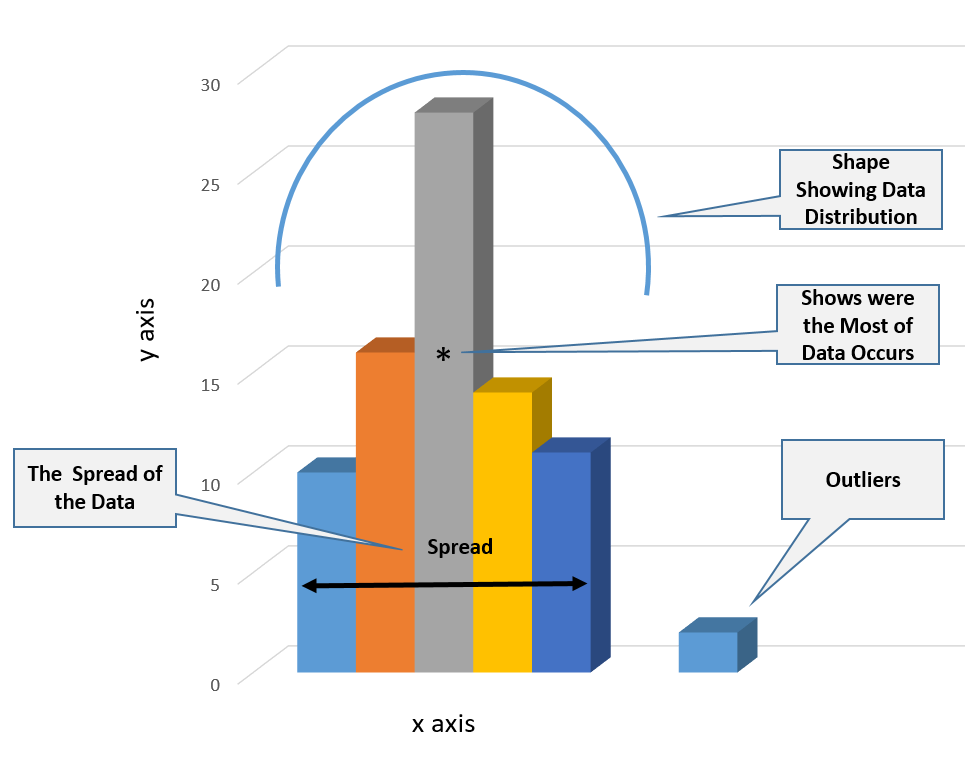
Histograms showcase the frequency of continuous data values (y axis) by displaying the distribution or “shape” of a data set. It also shows the spread of the data set (x axis) while capturing the presence of outliers or gaps in the data points. The histogram utilizes rectangular vertical bars to depict where most of the data occurs. These graphics should be constructed utilizing a sample size of at least 30 data points. If the data size is too small, the histogram may not accurately display the distribution.
Dot Plot
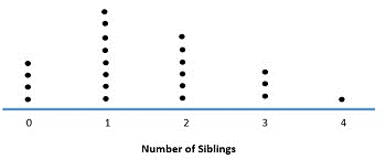
If the sample size is less than 30, a dot plot is preferred. A dot plot is a graphical representation of data utilizing dots plotted on a simple scale. Dot plot, when applied for small data sets, can be used for both continuous and discrete data sets. Above is a simple example of how a dot plot can be applied.
Histogram vs. Bar Chart
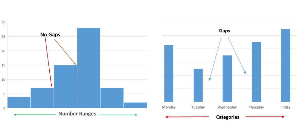
Each column or bar of the histogram represents the frequency of occurrence of quantitative continuous data (y axis). The columns or bars in a histogram and bar chart can vary in height and shape. However, as depicted above, the histogram has no spaces between the bars. What’s more, a bar chart shows the comparison of categorical discrete variables as opposed to number ranges.
Pareto Chart
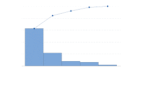
When a bar chart presents the categories of data in a descending order of frequency and the cumulative total is represented by the line, this is known as a Pareto Chart. Above is an example of a Pareto Chart exemplifying the descending order of category data and the cumulative total trend line. Pareto Charts are discussed in more detail by Alan Picarillo in the June, 2020 edition of MITE QI/PS Hot Topic.
Stem and Leaf Plot
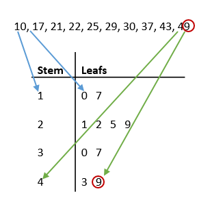
Stem and leaf plot is a frequency graphic less utilized but worth considering as a rapid approach to analyze and display data. The key difference between this plot and a histogram is that a stem and leaf plot can be constructed manually without the use of analytical software. Furthermore, a stem and leaf plot shows individual data points, resembling a table, whereas a histogram does not. The stem on the left displays the first digit(s) and the leaf on the right displays the last digit. Above, one can see that the individual data points in the 20-29 range are represented most often (four times) in the stem and leaf plot below.
Box and Whisker Plot
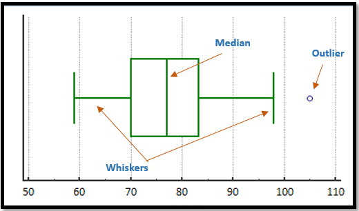
The box and whisker plot shows the following noteworthy statistics of data: median, maximum and minimum values, and upper and lower quartiles. The data are plotted in a way that the top 25% and the bottom 25% of the data points are represented by two whiskers. The box in the middle represents the remaining 50% of the data. Box and whisker plots are especially worthy when performing a comparison analysis between several data sets. This frequency plot allows for the visual comparision of central tendency, the variability of multiple data sets, and the presents of outliers. Above is an example of a horizontal box and whisker plot.
Selecting a frequency plot that best tells the quality improvement story has many benefits. Visual presentation of data can motivate and provide an opportunity to elicit contribution and buy in from stakeholders. These graphics also provide a method and means in which to monitor for success, change, and opportunities for improvement.
References
CIToolKit. (2020). Graphic Analysis. Retrieved September 12, 2021, https://citoolkit.com/articles/graphical-analysis/
CIToolKit. (2020). Histograms-and-Boxplots. Retrieved September 12, 2021, https://citoolkit.com/articles/histograms-and-boxplots/
Hessing, Ted. (n.d.). Frequency Plots. Retrieved: September 10, 2021, https://sixsigmastudyguide.com/frequency-plots/
Model Systems Knowledge Translation Center (MSKTC). (n.d.). Effective Use of Histograms. Retrieved: August 19, 2021, https://msktc.org/lib/docs/KT_Toolkit/Charts_and_Graphs/Charts_Tool_Histograms_508c.pdf
Stem-and-leaf display. (2021, August 14). In Wikipedia. https://en.wikipedia.org/wiki/Stem-and-leaf_display
Want to earn CE credits? Click here!
Download PDF